


In this guide, we’ll take you through the process of utilizing Swift Charts to create captivating graphs using SwiftUI’s declarative syntax.
Swift Charts seamlessly integrates with SwiftUI, Apple’s modern UI framework, enabling you to enhance the visual appeal of your iOS applications and effectively communicate data. With its intuitive and easy-to-understand syntax, you can effortlessly build beautiful and responsive user interfaces.
Throughout this tutorial, we’ll explore various chart types and provide practical examples to ensure you grasp the concepts effectively. So, if you’re ready to dive into the world of charting in SwiftUI and learn how to create visually appealing charts, let’s get started.
Have you ever wondered how those colorful graphs are made in apps? They make data exciting and easy to understand! Well, there’s a special tool called Swift Charts that helps us create those awesome figures for our iPhone and iPad apps.
To understand this, let’s first talk about SwiftUI. It’s like a magic language that lets us build an app’s look and feel. Instead of writing complicated code, we can use simple words to describe how an app should look. It’s like giving instructions to a computer in a really easy way!
Whether you want to show how the temperature changes throughout the day or how many points you scored in a game, you have the ability to turn that information into colorful and interactive visual representations!
Swift Charts offers different types of charts. For example, if you need a line chart, it’s like drawing a wavy line that goes up and down to represent changes over time. On the other hand, a bar chart uses bars to visually depict different amounts.
The best part is that you have complete control over the appearance of your visualizations. You can customize the colors, sizes, and styles to match your app’s design. To make them even more engaging, you can add special markers like dots, rectangles, and rule markers to draw attention to specific points on the chart.
Swift Charts offers a wide range of capabilities that enhance your app’s visual representation and user experience.
Integration with SwiftUI’s Declarative Syntax: By seamlessly integrating with SwiftUI, Swift Charts allows you to effortlessly create graphs using its intuitive declarative syntax.
Versatile Types: With Swift Charts, you have the freedom to showcase data trends over time or make effective comparisons between different categories. Its diverse visualization options ensure you can present your data in the most impactful way.
Unleash Your Creativity: Swift Charts empowers you with complete control over the appearance of your visualizations. You can effortlessly customize the color, style, and thickness of lines to achieve the desired look and feel. Furthermore, you can adjust the width, spacing, and color of bars, enabling you to create stunning bar charts.
Engaging Interactive Elements: Swift Charts provides a range of interactive features that enrich the user experience. You can incorporate various markers, such as point markers, rectangles, areas, and rule markers, to draw attention to specific data points and make your visual depictions more engaging and informative.
Seamless Integration into Your UI: Thanks to its seamless integration with SwiftUI components, Swift Charts allows you to seamlessly incorporate your visualizations into other elements of your user interface. This ensures a cohesive and polished user experience, where your charts harmoniously blend with the overall app design.
To fully leverage the capabilities of Swift Charts, it’s important to understand its fundamental pillars that shape its functionality. Let’s delve into the key components that form its foundation.
Marks: At the core of Swift Charts are graphical elements known as marks. These marks serve as visual representations of data, and Swift Charts offers a rich variety of predefined mark types. From bars, lines, and points to rectangles, areas, and rules, these versatile mark types allow developers to transform data into captivating visuals effortlessly.
Properties: Swift Charts provides a wide range of customizable properties that allow developers to shape the appearance and behavior of their charts. With properties, you can fine-tune every aspect of your chart, including color schemes, fonts, animations, and transitions. This level of control empowers you to create visually stunning and cohesive chart designs that seamlessly integrate with the overall user experience.
Modifiers: Enhancing and fine-tuning charts is made easy with Swift Charts’ extensive set of modifiers. These modifiers offer flexibility in adjusting the positioning, alignment, and interactivity of chart elements. Whether it’s modifying the layout, applying transformations, or adding interactive gestures, modifiers provide the necessary tools to achieve the desired visual and interactive experience.
Data: Swift Charts revolves around the data itself. It effortlessly handles various types of data, including quantitative, nominal, and temporal. This allows developers to visualize and analyze a diverse range of datasets effectively. By leveraging the robust data handling capabilities of Swift Charts, you can create dynamic and informative visual representations that effectively communicate insights to your users.
By harnessing the flexibility of marks, utilizing the visual customization provided by properties, leveraging the versatility of modifiers, and making the most of its comprehensive data handling capabilities, developers can create highly interactive visualizations that bring data to life.
This guide showcases the versatility of Swift Charts library for constructing different chart styles tailored to specific data visualization needs.
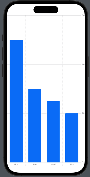
When it comes to visually comparing categorical data or displaying information in distinct categories, bar charts are an invaluable tool. With Swift Charts, creating bar charts that effectively communicate your data becomes a seamless process. Let’s delve into the process of building it and explore the powerful features offered by the BarMark class.
The BarMark class is a fundamental component in Swift Charts that allows you to generate customizable bars on the chart. These bars serve as visual representations of your data points, providing a clear and concise view of the information you want to convey. With adjustable x-axis and y-axis values, you have the freedom to precisely position and scale the bars according to your data.
Moreover, you have complete control over the appearance of the bars. You can effortlessly modify their color, width, and style to align them with your app’s design aesthetic. Whether you prefer vibrant hues or a more subdued palette, Swift Charts enables you to create visually appealing bar charts that seamlessly blend into your app’s overall look and feel.
Here’s an example code snippet for creating a bar chart:
import SwiftUI
import Charts

struct ContentView: View {

    var body: some View {

        Chart {

            // TODO add Marks
            BarMark(
                x: .value("Day","Mon"),
                y: .value("Min", 50)
            )
            BarMark(
                x: .value("Day", "Tue"),
                y: .value("Min", 30)
            )
            BarMark(
                x: .value("Day", "Wed"),
                y: .value("Min", 25)
            )
            BarMark(
                x: .value("Day", "Thu"),
                y: .value("Min", 20)
            )
        }
    }
}
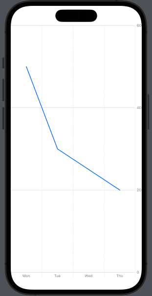
Line charts are an effective way to showcase trends and patterns in data over time or continuous data. In Swift, you can create line charts using the LineMark class, which connects data points on the chart, providing valuable insights into patterns, trends, and fluctuations.
With Swift’s LineMark class, constructing line charts becomes a straightforward process. This class enables you to plot data points and draw lines that connect them, effectively visualizing the progression of values over time or any continuous scale. The result is a clear representation of how data evolves, making it easier to identify trends, changes, and correlations.
With various customization options for line charts, you can tailor their appearance to match your app’s design and branding. You can adjust the line color, thickness, and style to create charts that align harmoniously with your app’s visual identity.
Here’s an example code snippet:
import SwiftUI
import Charts

struct ContentView: View {

    var body: some View {

        Chart {

            // TODO add Marks
            LineMark(
                x: .value("Day","Mon"),
                y: .value("Min", 50)
            )
            LineMark(
                x: .value("Day", "Tue"),
                y: .value("Min", 30)
            )
            LineMark(
                x: .value("Day", "Wed"),
                y: .value("Min", 25)
            )
            LineMark(
                x: .value("Day", "Thu"),
                y: .value("Min", 20)
            )
        }
    }
}
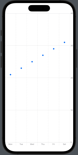
Point charts serve as an excellent choice when it comes to showcasing scattered or discrete data points, enabling you to emphasize specific observations or patterns within data distribution. Within the realm of Swift Charts, the PointMark class empowers developers to effortlessly create point charts that effectively capture the essence of each individual data point with adjustable x-axis and y-axis values.
With point charts, you can visually represent the relationships and variances between various data points. Whether you’re examining the correlation between variables, identifying outliers, or highlighting key data points, the PointMark class allows for precise and intuitive representation.
By leveraging the flexibility and customization options provided by the PointMark class, you can tailor the appearance of each data point on the chart to align with your app’s design and visual style. Adjusting the size, color, and shape of the points enables you to create a cohesive and engaging visual representation that effectively communicates the underlying data.
Here’s an example code snippet:
import SwiftUI
import Charts

struct ContentView: View {

    var body: some View {

        Chart {

            // TODO add Marks
            PointMark(
                x: .value("Day","Mon"),
                y: .value("Min", 21)
            )
            PointMark(
                x: .value("Day", "Tue"),
                y: .value("Min", 23)
            )
            PointMark(
                x: .value("Day", "Wed"),
                y: .value("Min", 25)
            )
            PointMark(
                x: .value("Day", "Thu"),
                y: .value("Min", 27)
            )
            PointMark(
                x: .value("Day", "Fri"),
                y: .value("Min", 29)
            )
            PointMark(
                x: .value("Day", "Sat"),
                y: .value("Min", 31)
            )
        }
    }
}
Also read - Essential, Yet Underrated Skills for UX Designers to Thrive
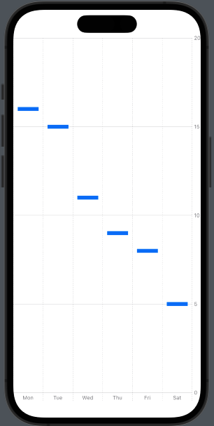
Rectangle charts provide a powerful means of visualizing comparative data or displaying data in ranges. These charts are particularly effective when you want to emphasize differences or proportions between different data categories. With the RectangleMark class, you can effortlessly create attractive rectangle charts that accurately represent the magnitude or extent of your data points.
The RectangleMark class allows you to define each element of the chart as a rectangle, where the size and position of the rectangle correspond to specific data values. This enables you to visually compare and analyze data categories based on their respective dimensions and proportions.
By leveraging the flexibility of the RectangleMark class, you can easily customize the appearance of your rectangle charts. Adjusting properties such as color, width, height, and alignment empowers you to create visually appealing and informative representations of your data.
Whether you’re visualizing sales figures for different product categories, comparing population sizes of various cities, or illustrating the distribution of expenses across different budget categories, rectangle charts provide a clear and concise way to showcase the relative magnitudes or proportions within your data.
Here’s an example code snippet:
import SwiftUI
import Charts

struct ContentView: View {

    var body: some View {

        Chart {

            // TODO add Marks
            RectangleMark(
                x: .value("Day","Mon"),
                y: .value("Min", 16)
            )
            RectangleMark(
                x: .value("Day", "Tue"),
                y: .value("Min", 15)
            )
            RectangleMark(
                x: .value("Day", "Wed"),
                y: .value("Min", 11)
            )
            RectangleMark(
                x: .value("Day", "Thu"),
                y: .value("Min", 9)
            )
            RectangleMark(
                x: .value("Day", "Fri"),
                y: .value("Min", 8)
            )
            RectangleMark(
                x: .value("Day", "Sat"),
                y: .value("Min", 5)
            )
        }
    }
}
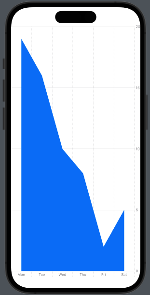
Area charts are a powerful visualization tool for showcasing cumulative data trends or the total value over time, providing a clear representation of the overall pattern or magnitude of the data. With Swift Charts, you can easily create area charts using the AreaMark class, which enables the creation of filled area elements that effectively display data accumulation or progression.
The AreaMark class offers a range of customization options to tailor the appearance of your area charts. You have the flexibility to adjust the color, opacity, and thickness of the filled areas, allowing you to match the chart’s visual style with your app’s design. By combining different colors and gradients, you can further enhance the visual impact of your area charts and make them more engaging for your users.
One of the key advantages of using area charts is their ability to showcase the cumulative nature of data. As the filled areas accumulate over time or along the x-axis, it becomes easier to identify trends, spot patterns, and understand the overall growth or decline in the data. This makes area charts particularly useful for displaying financial data, population trends, or any other data that involves cumulative values.
Here’s an example code snippet:
import SwiftUI
import Charts

struct ContentView: View {

    var body: some View {

        Chart {

            // TODO add Marks
            AreaMark(
                x: .value("Day","Mon"),
                y: .value("Min", 19)
            )
            AreaMark(
                x: .value("Day", "Tue"),
                y: .value("Min", 16)
            )
            AreaMark(
                x: .value("Day", "Wed"),
                y: .value("Min", 10)
            )
            AreaMark(
                x: .value("Day", "Thu"),
                y: .value("Min", 8)
            )
            AreaMark(
                x: .value("Day", "Fri"),
                y: .value("Min", 2)
            )
            AreaMark(
                x: .value("Day", "Sat"),
                y: .value("Min", 5)
            )
        }
    }
}
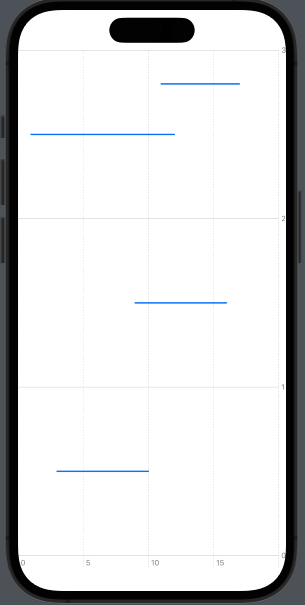
Rule charts are effective for visualizing specific data ranges and highlighting data boundaries and reference lines. With the RuleMark class, you can effortlessly create visually informative rule charts. These charts utilize line elements to represent defined ranges with starting and ending points on the chart. By incorporating rule charts into your visualizations, you can provide valuable insights into data comparisons and reference points.
The versatility of rule charts extends beyond simple data representation. They allow you to emphasize important thresholds, benchmarks, or target values within your data. By leveraging the flexibility of the RuleMark class, you can easily customize the appearance of the lines, such as their thickness, color, and style, to match your app’s design aesthetic.
Whether you need to illustrate specific data ranges, draw attention to critical values, or provide visual guidance for comparisons, rule charts offer a powerful visual tool. With their ability to represent data boundaries and reference lines in a clear and concise manner, they enhance the comprehensibility of your visualizations and enable users to gain deeper insights into your data.
Here’s an example code snippet:
import SwiftUI
import Charts

struct ContentView: View {

    var body: some View {

        Chart {

            // TODO add Marks
            RuleMark(
                xStart: .value("Start", 1),
                xEnd: .value("End", 12),
                y: .value("Value", 2.5)
            )
            RuleMark(
                xStart: .value("Start", 9),
                xEnd: .value("End", 16),
                y: .value("Value", 1.5)
            )
            RuleMark(
                xStart: .value("Start", 3),
                xEnd: .value("End", 10),
                y: .value("Value", 0.5)
            )
            RuleMark(
                xStart: .value("Start", 11),
                xEnd: .value("End", 17),
                y: .value("Value", 2.8)
            )
        }
    }
}
Also read - 7 Strategies for Crafting Powerful Search Functions in Digital Products
Let’s delve into some real-world examples that demonstrate the effective use of Swift Charts to create visually compelling and informative visualizations.
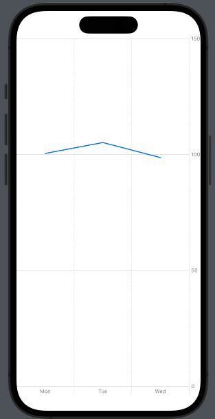
Financial Analytics Dashboard: Imagine you’re building a financial analytics app that tracks and visualizes stock market data. You can utilize line charts to display stock prices over time, enabling users to analyze trends and make informed investment decisions.
import SwiftUI
import Charts

struct ContentView: View {

    var body: some View {

        Chart {

            // TODO add Marks
            LineMark(
                x: .value("Day", "Mon"),
                y: .value("Price", 100.5)
            )
            LineMark(
                x: .value("Day", "Tue"),
                y: .value("Price", 105.2)
            )
            LineMark(
                x: .value("Day", "Wed"),
                y: .value("Price", 98.7)
            )
            // Add more data points as needed
        }
    }
}
This code snippet demonstrates the implementation of a line chart for a financial analytics dashboard. It visualizes the daily price fluctuations of a particular asset (represented on the x-axis) against the corresponding price value (represented on the y-axis). Each LineMark represents a data point, with the x-value indicating the day of the week and the y-value representing the price.
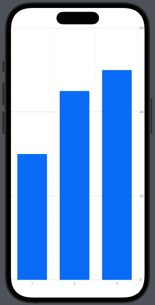
Fitness Tracking App: If you’re developing a fitness tracking app, you can use bar charts to display users’ workout progress over time. This allows them to track their performance and set new fitness goals.
import SwiftUI
import Charts

struct ContentView: View {

    var body: some View {

        Chart {

            // TODO add Marks
            BarMark(
                x: .value("Week", "1"),
                y: .value("Workout Duration", 30)
            )
            BarMark(
                x: .value("Week", "2"),
                y: .value("Workout Duration", 45)
            )
            BarMark(
                x: .value("Week", "3"),
                y: .value("Workout Duration", 50)
            )
            // Add more data points as needed
        }
    }
}
This code snippet showcases the usage of a bar chart in a fitness tracking app. It represents the weekly workout durations (x-axis) and the corresponding duration values (y-axis). Each BarMark represents a data point, with the x-value indicating the week number and the y-value representing the workout duration in minutes.
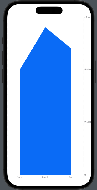
Sales Performance Monitoring: Suppose you’re building a sales management platform for a retail company. You can generate dynamic area charts to illustrate sales performance across different regions or product categories. This visual representation helps managers identify top-performing areas and make data-driven decisions for sales strategies.
import SwiftUI
import Charts

struct ContentView: View {

    var body: some View {

        Chart {

             // TODO add Marks
            AreaMark(
                x: .value("Region", "North"),
                y: .value("Sales ($)", 5000)
            )
            AreaMark(
                x: .value("Region", "South"),
                y: .value("Sales ($)", 7000)
            )
            AreaMark(
                x: .value("Region", "East"),
                y: .value("Sales ($)", 6000)
            )
            // Add more data points as needed
        }
    }
}
This code snippet illustrates the utilization of an area chart for sales performance monitoring across different regions. The x-axis represents the regions (e.g., North, South, East), while the y-axis represents the sales figures. Each AreaMark represents a data point, with the x-value indicating the region and the y-value representing the sales value.
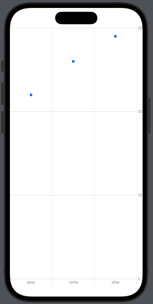
Weather Data Visualization: If you’re working on a weather app, you can leverage point charts to display temperature fluctuations throughout the day. Users can easily grasp the temperature patterns and plan their activities accordingly.
import SwiftUI
import Charts

struct ContentView: View {

    var body: some View {

        Chart {

            // TODO add Marks
            PointMark(
                x: .value("Time", "9AM"),
                y: .value("Temperature (°C)", 22)
            )
            PointMark(
                x: .value("Time", "12PM"),
                y: .value("Temperature (°C)", 26)
            )
            PointMark(
                x: .value("Time", "3PM"),
                y: .value("Temperature (°C)", 29)
            )
            // Add more data points as needed
        }
    }
}
This code snippet showcases the implementation of a point chart for visualizing weather data. The x-axis represents different time intervals (e.g., 9AM, 12PM, 3PM), while the y-axis represents the corresponding temperature values. Each PointMark represents a data point, with the x-value indicating the time and the y-value representing the temperature.
Also read – The Iterative Design Process: A Comprehensive Guide for UX Designers
Swift Charts not only enables the creation of visually stunning data representations but also empowers developers with a wide range of customization options and advanced features. Let’s delve into these capabilities that take your visualizations to the next level:
Customization Options: Swift Charts puts you in the driver’s seat when it comes to the look and feel of your graphs. With comprehensive customization options, you can effortlessly tweak colors, fonts, labels, axes, legends, and more. Thanks to the power of SwiftUI’s declarative syntax, modifying these elements is intuitive and seamless.
Tailoring to Specific Requirements: Swift Charts allows you to tailor your graphs to your specific needs. You have the flexibility to switch between different mark styles, such as bars, lines, points, rectangles, areas, and rules, based on the nature of your data. Additionally, you can fine-tune the positioning and scaling of the data points, ensuring your visualizations accurately represent the underlying information.
Animation and Interactivity: With built-in animation support, Swift Charts lets you bring your graphs to life. You can add smooth transitions and dynamic updates to your visualizations, creating an engaging user experience. Whether it’s animating data updates or enhancing the overall chart appearance, these animations captivate users and highlight key insights. The interactivity options further enrich the user experience, allowing users to zoom, pan, or tap on data points to explore detailed information.
Integration with Data Sources: Swift Charts seamlessly integrates with various data sources, making it a breeze to create meaningful visualizations. By connecting your charts to data models, databases, or APIs, you can achieve real-time updates and synchronization with changing data. This integration simplifies the process of visualizing dynamic data, empowering you to build data-driven applications effortlessly.
Advanced Functionalities: In addition to its fundamental charting capabilities, Swift Charts offers advanced functionalities that elevate your visualizations. For instance, it supports multiple axes, enabling you to display multiple data series with different scales on a single chart. This feature is particularly valuable when comparing data sets with varying ranges. Swift Charts also provides interactive legends, allowing users to toggle the visibility of specific data series or customize the chart’s appearance on the fly.
Also read – Designing Chronological Activity Feeds: An Expert Guide
In conclusion, Swift Charts is a powerful and user-friendly charting library, enabling developers to effortlessly create visually captivating and interactive charts for their iOS applications. By harnessing the declarative syntax of SwiftUI and leveraging the versatile features of Swift Charts, developers can easily tailor the appearance and behavior of visual depictions and effectively communicate data insights. If you want to enhance your app’s visual representation of data and engage your users, our experienced development team is here to assist you. Contact us today to unlock the full potential of data visualization in your iOS apps. Explore our iOS development services to discover how we can help you create exceptional applications.