

Have you ever taken a trip with friends and heard yourself often say, “This one’s on me”? But quietly thought, “last time.”
Enter Splitwise 👇
Over the last decade, this product concept has found global audience. Splitwise has attracted tens of millions of registered users who have shared or managed what is calculated to be $90 billion since 2011.
Splitwise is one of the few consumer fintech apps that has grown organically without spending much on CAC. Because as they claim, they have been able to attract new users without it.
It’s important to note that Splitwise, unlike Venmo or Paytm – doesn’t let people transfer money, but just about keep track of it.
Should that make Splitwise a market disruptor?
Since Splitwise works on a freemium model, the basic functionality is enticing for new users. Once they get used to it, ofcourse there is an upsell that costs $3 to upgrade.
Classic PLG. Splitwise doesn’t make money through onboarding new users. It makes money by converting users “who want more” into loyal customers.
Products are about usability. As designers we often talk about products we like and use, but also ponder over things that would make the product better.
So Splitwise came boomer-ranging right infront of us, and then solving for it was just a rabbit hole we fell into👇
A few folks from the design team at our office went out for lunch. Since we were a big group, someone suggested we create a ‘Splitwise’ group since we frequent lunches together.
Ishan, one of our UX specialists, jokingly sneered, “Not until someone fixes the bugs.”
A few of us shrugged like our usual self. Some problems you see, and just ignore to go on and live your life 🤷 But but Ishan went on to add:
“No, really, think about it. Splitwise is tricky. Sometimes it gets too personal. This one time, I got an email at 2 am saying, ‘Hi, you owe me some money,’. Turns out it was my cousin, and I owed him ₹20.25 bucks. I just shut the app and went back to sleep🤷♂️”
What Ishan didn’t realize was that he had fumbled upon a golden UX epiphany-
How well is Splitwise adapting to human emotion? Especially when it is solving for an inter-personal financial dynamic?
So when we got back to the office, Ishan dug deeper.
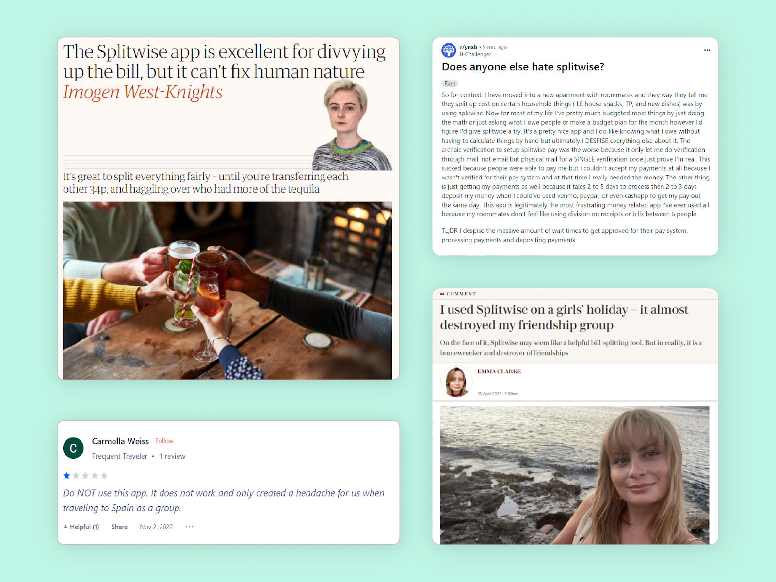
Turns out, the world (okay, users) agrees with us.
If user feedback is the ultimate primer to measure the impact of UX on your product, the case of Splitwise is like the case of a chair:
Imagine a chair (or any product for that matter). What’s a ‘successful’ chair? From a business perspective, the sale value, of course. But from a design perspective?
The success of the design of a chair is not defined by how many people buy the chair, but by how many people enjoy sitting on that chair again, and again.
Let’s take this analogy to Splitwise.
At the center of the Splitwise story, lies a question that UX designers often juggle to balance.
Product owners wish their users understood their products better.
Users wish products understood their needs better.
As designers, finding the line of balance means optimizing for human behavior and emotion, always.
We think Splitwise aims to solve a specific user problem: Helping people enjoy spending time with friends and family without worrying about ‘spending too much in excitement, and not keeping tabs on it later’.
The customer feedback we saw earlier was, at best an intended consequence for Splitwise.
And this is what really lead us to throw the spaghetti on the wall, and we got writing 🤷♂️
How do we take a balanced approach to address both the rational and emotional side of the user?
In the context of Splitwise, this meant designing user experiences that solve for a genuine yet awkward human instinct — our inability to rationalize financial conversations with people we care about.
One of the most important things to consider is that almost all of Splitwise users use the app with friends or family. ‘Adding’ someone to a Splitwise group = confidential & personal space.
And as we know, money is a slippery slope, especially with people you care about. Friends often don’t like fretting over small details and don’t enjoy them confrontations that might upset the other.
Looks like that’s why Splitwise caters to a special group dynamic, where user empathy takes center stage.
So we thought🧠
If Splitwise is an app to save humans from awkward money conversations, how do we make the experience of using it more humane?
We found out👇
Problem: Sporadic visual hierarchy & page structure
One of the most important visual elements in Splitwise is – ‘adding expense’. It feels harder to execute than it looks at first.
Case in point 👇
When trying to add an expense, multiple input fields show up all at once, while many key elements are hidden.
Why is that a problem? 🤔
A quick expanse is most often created around other people (so you don’t forget it later). It needs to be quick, so the user can quickly get off their phone and get back to mingling with the group. A tedious process keeps a user engaged for longer, and that’s against the point of this functionality. That could lead to a frustrated user, trying to remember how much their friend owes them while figuring out how to add that expense (given the visual clutter).
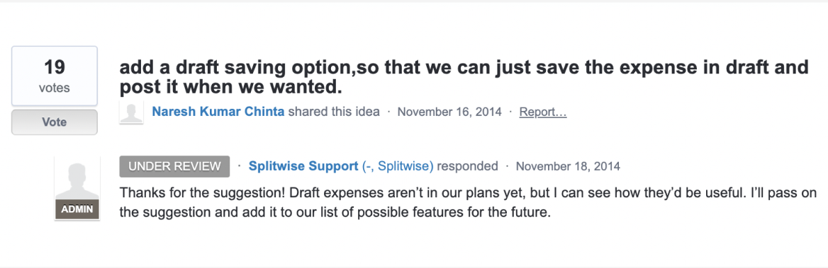
Why? Because users asked 🗣️
This feature will help users save expense details and add them later 👇
Problem: Discoverability of features
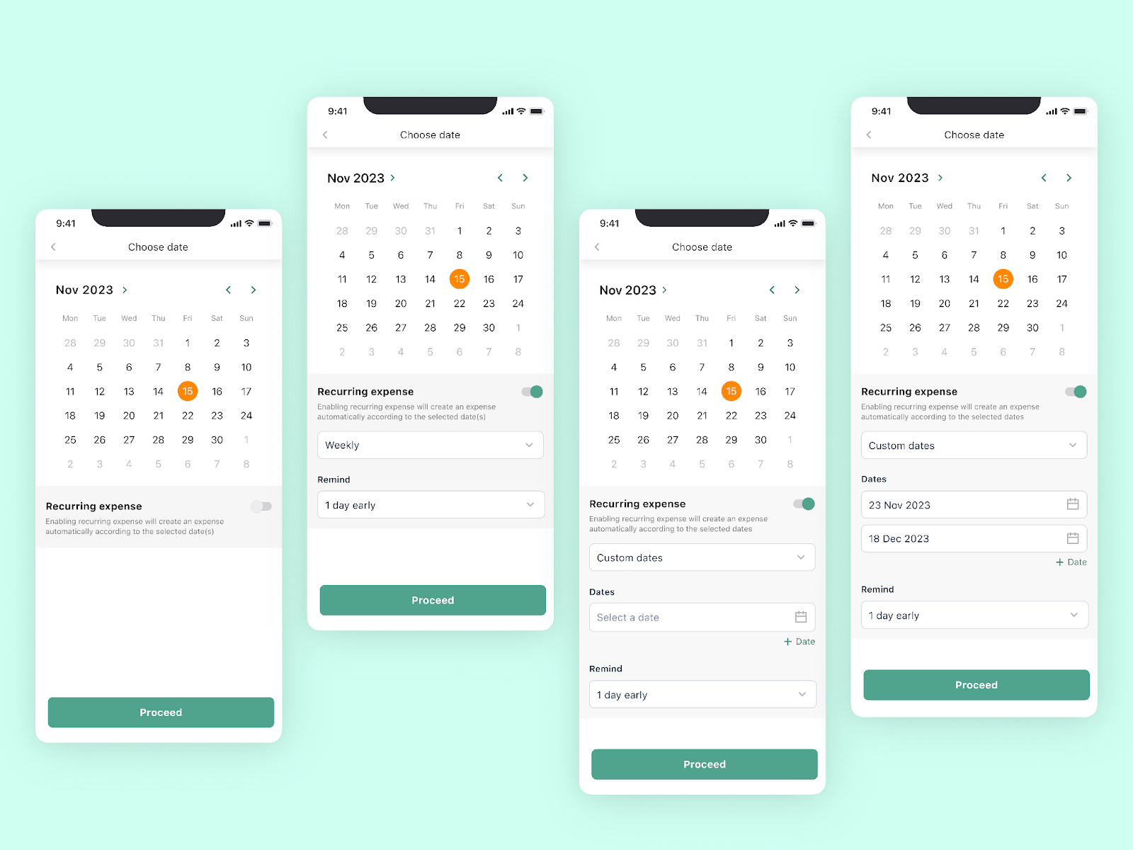
Recurring expense is one of Splitwise’s highly marketed features. Yet, it’s hard to find & use 🤷♂️
Case in point 👇
When adding a date during adding an expense, the placement and visual prominence of the ‘recurring expense’ option is easy to miss. Moreover, once you find the recurring option, it involves many steps and screens to add a recurring expense.
Why is that a problem? 🤔
A recurring expense functionality caters to a chain of information. A single mistake glitches the entire algorithm (money calculation in Splitwise’s case). Which means, a single error can render the entire money record on splitwise inaccurate. This de-motivates user to fix the entire chain, and hence a single miss might mean getting off the app either temporarily or permanently.
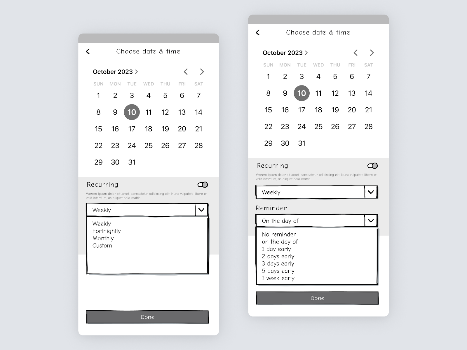
Adding custom option to add custom dates: Provides flexibility as users can set recurring dates of their choice
Problem: Exhaustive steps & longer processes
The primary actions of Splitwise: ‘Adding Expense’ & ‘Settle Up.’
To complete both these tasks users have to go through multiple screens every time they us these functions.
Case in point👇
No. of steps to add an expense –
Add Expense> Choose payer> Add amount> Recurring Expense> Split Options
Also, there is no way to settle multiple debts at once.
Why is that a problem?🤔
Adding expanse and settling it up as a functionality, is the reason Splitwise is relevant to the user as an app. As flagship features that control the flow of why you use Splitwise in the first place, they should be simpler to execute than they are currently.
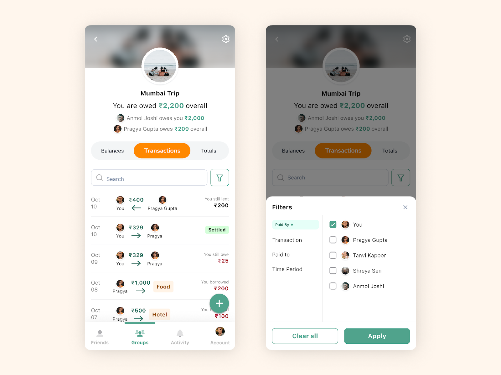
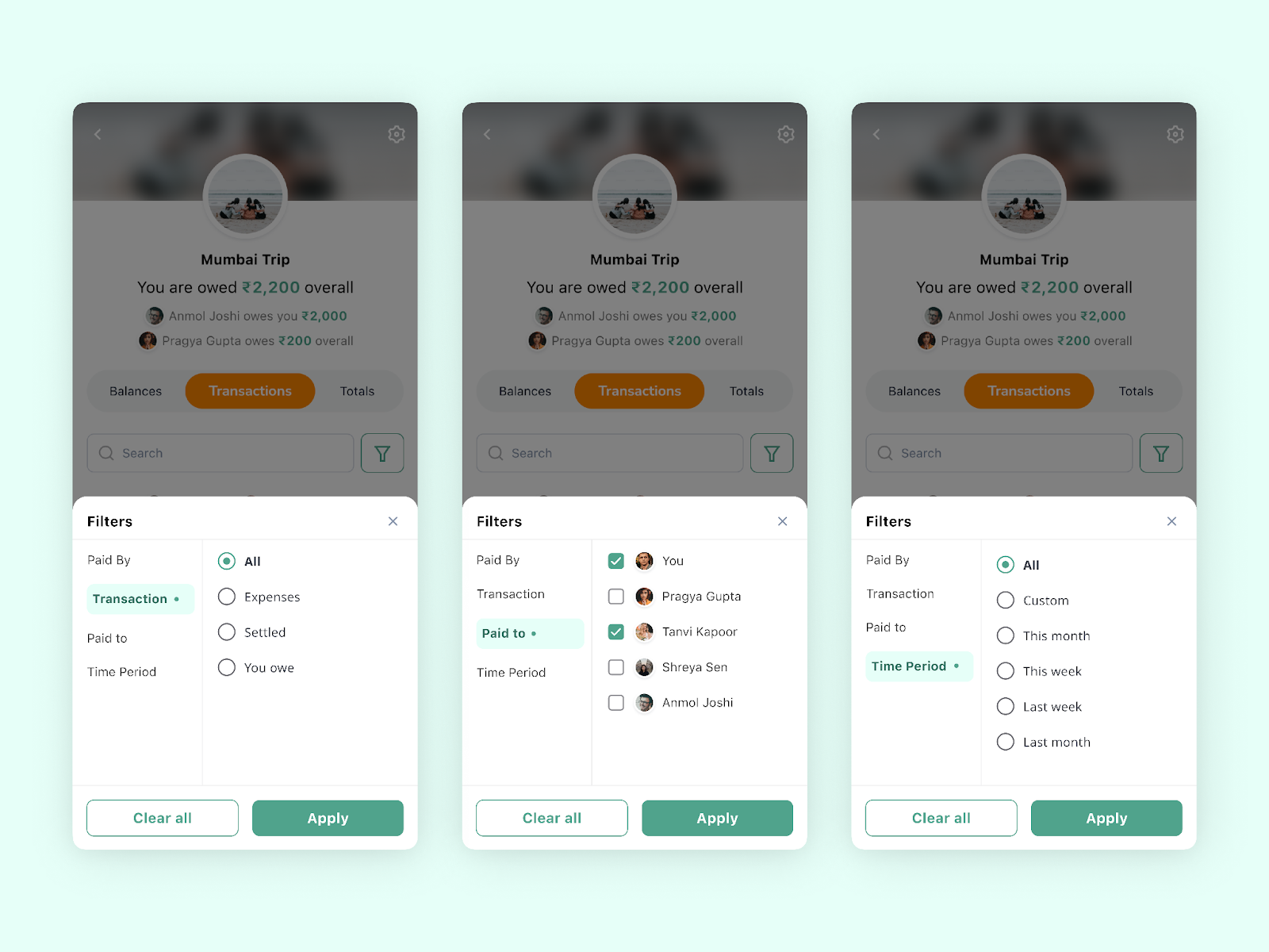
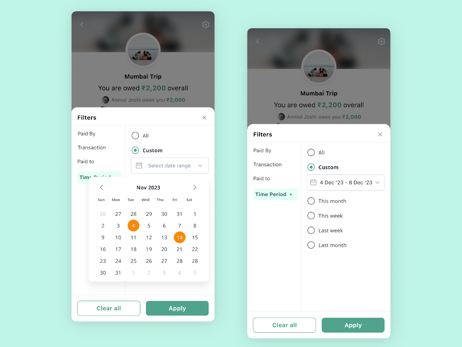
Problem: Visual load on the landing screen
The group landing page is packed with information. There’s text-viusal & numeric elements scattered everywhere you look. The scope of information architecture alignment is huge.
Case in point👇
Users need help navigating to the desired expense: If they want to see the expense/settled amount involving a specific user / specific date / specific category, they have to keep scrolling to find the desired expense/settlement entry.
Why is that a problem?🤔
The longer you use Splitwise, the more the history of transactions. Imagine having to scroll through hundreds of past activities to find what you need today.
Also, all entries look the same (with little to no distinction), and since it’s the landing page of the group, it could potentially frustrate users.
Sorting out visual hierarchy on the group landing page (transaction log). Adding features to refine the results on the page. Using more visuals rather than just text.
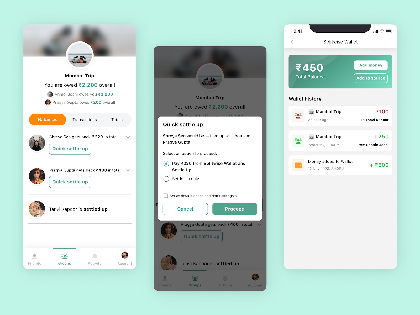
Problem: Going to other apps to pay the money
There is no way to settle the debt by paying the amount within the app. There are 3rd party options, but they’re not holistic and exclude certain user types.
Case in point👇
There is integration with Paytm, but that is only available to Android users leaving iOS users with the task of paying separately through other payment apps.
Why is that a problem?🤔
Removing the hassle of paying through other payment apps would be a game changer for Splitwise as it would allow the users just to check the debt amount and pay it directly to the group member with the click of a button within the app.
Since different users might be comfortable with different payment apps and also to avoid the hassle of integrating all of them on the platform, we can provide an option of a common Splitwise wallet.
The users can add money to this wallet through their credit/debit cards and pay directly to group members.
The users can also transfer the amount added/received in Splitwise wallet back to their source account
Our inherent desire to push the boundaries of “good design” continues to drive us to enhance fundamental parts of our social landscape. Hence Splitwise fits — helping people connect with money better, without losing their humane connection with other people.
At the very core, we induce elements into the app’s interface focusing on user-centric enhancements across a simple yet core functionality:
Our approach is rooted in understanding the delicate dynamics of shared finances among friends and family, where empathy takes center stage.
By re-crafting design elements, we alleviate user frustration, enhance accessibility, and streamline the process of managing shared expenses.
As we navigate the complexities of personal finance intertwined with social relationships, our UX interventions strive to pave the way for a more intuitive, seamless, and user-friendly experience within Splitwise.
The goal remains not just to manage expenses but to facilitate stronger, more harmonious bonds among users, making the financial aspect of friendships a simpler, more enjoyable journey.