


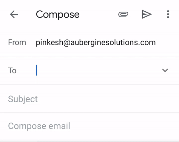
So when we select any name from the list, It gets transformed into something that is visually very compact but shows details of what exactly selected.
That is called ‘Chip’
Chips are compact elements that represent an input, attribute, or action.
Basic Chip widget in Flutter looks like…
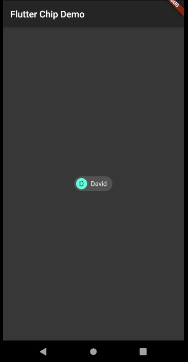
UI structure
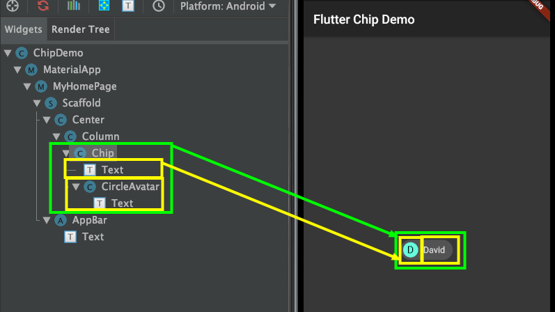
Chip(
  avatar: CircleAvatar(
    backgroundColor: Theme.of(context).accentColor,
    child: Text('D'),
  ),
  label: Text('David'),
)
Let’s see some of its properties quickly –
ⓛabel: required
It accepts any widget but, Mostly it is good to have Text widget represting name of any entity,action etc.

ⓐvatar:
It accepts any widget and can be used to show image, intial letter of any entity,action etc.
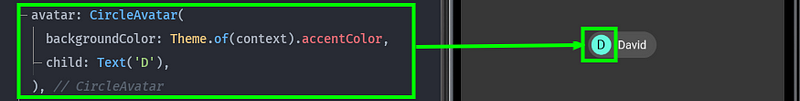
ⓑackgroundColor:
Showing background color of chip when it is unselected and enabled.

ⓛabelStyle:
Used to apply any TextStyle to the label.

ⓛabelPadding:
Adds some padding around the label

ⓔlevation:
It accepts double value and used to elevate the chip

ⓢhadowColor:
Gives color to the shadow of the chip when elevation is set

ⓓeleteIcon:
Used to display delete icon. This will be only visible when onDeleted is set.
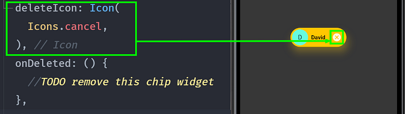
ⓞnDeleted:
It’s a callback when delete icon is pressed inside the chip.

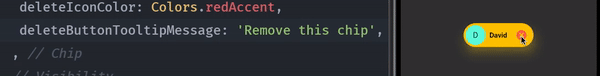
ⓓeleteIconColor:
Color to be set for delete icon

ⓓeleteButtonTooltipMessage:
Set a message to appear on tooltip of delete icon.
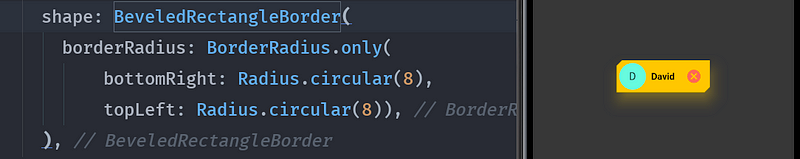
ⓢhape:
Can be used to give shapes to the border of the chip. something like this.
Congratulations!! You have got the basic idea about how Chip widget works in Flutter.
Now let’s see types of chip
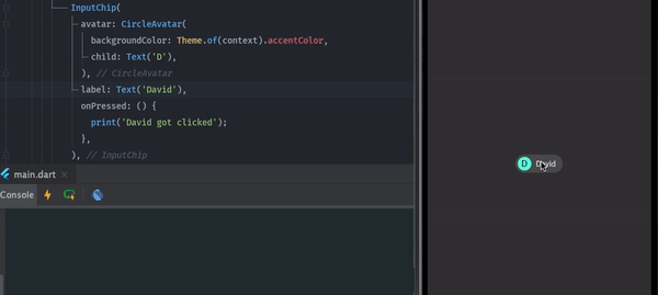
➊ Input chips
Input chips represent the information that was presented as part of the selection.
A very common example of this is already shown at the start of this story. i.e Gmail’s composing screen.
It can also be used for showing suggested responses in any messaging app. So that when the user clicks on it, the message contained in the input chip goes as a response.
Example of Input chip with onPressed event.
InputChip(
  avatar: CircleAvatar(
    backgroundColor: Theme.of(context).accentColor,
    child: Text('D'),
  ),
  label: Text('David'),
  onPressed: () {
    print('David got clicked');
  },
)
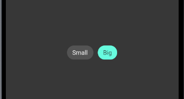
➋ Choice chips
The choice chip allows selecting a single chip from the list. Sometimes it can replace the other widgets which allow single selection like toggle button and radio button.
Example of Choice chip with onSelected event.
Wrap(
  children: [
    ChoiceChip(
      label: Text('Small'),
      selected: false,
      onSelected: (bool selected) {
        setState(() {});
      },
    ),
    SizedBox(
      width: 10,
    ),
    ChoiceChip(
      label: Text('Big'),
      selected: true,
      onSelected: (bool selected) {
        setState(() {});
      },
      selectedColor: Theme.of(context).accentColor,
    ),
  ],
)
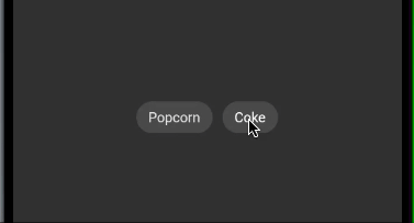
➌ Filter chips
Filter chip contains options, attributes, categories so that users can filter from it. You can easily replace the checkbox with Filter chip.
Example of Filter chip with onSelected event.
Wrap(
  children: [
    FilterChip(
      label: Text('Popcorn'),
      selected: false,
      onSelected: (bool selected) {
        setState(() {});
      },
    ),
    SizedBox(
      width: 10,
    ),
    FilterChip(
      label: Text('Coke'),
      labelStyle: TextStyle(
          color: widget.isSelected ? Colors.black : Colors.white),
      selected: widget.isSelected,
      onSelected: (bool selected) {
        setState(() {
          widget.isSelected = !widget.isSelected;
        });
      },
      selectedColor: Theme.of(context).accentColor,
      checkmarkColor: Colors.black,
    ),
  ],
)
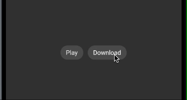
➍ Action chips
Action chips can be used to invoke some action on primary content. It can not be disabled because if it is not needed then it should not even available to users.
For example, the user can take action like playing or downloading the song.
Wrap(
  children: [
    ActionChip(
      label: Text('Play'),
      onPressed: () {
        //TODO
      },
    ),
    SizedBox(
      width: 10,
    ),
    ActionChip(
      avatar:
          widget.isSelected ? CircularProgressIndicator() : null,
      label: Text(
          '${widget.isSelected ? 'Downloading...' : 'Download'}'),
      labelStyle: TextStyle(color: Colors.white),
      onPressed: () {
        setState(() {
          widget.isSelected = !widget.isSelected;
        });
      },
    ),
  ],
)
That looks like you have learned a lot today.
Full code can be found here
Conclusion:
The Chip widget, which we discussed in this post, is a vital and multifaceted component of the Flutter toolkit that allows developers to make UI components interactive and dynamic with ease. From input and choice chips to filter and action chips, the possibilities are as limitless as your creativity.
Remember, the Chip widget isn’t just about aesthetics; it’s about functionality and user experience. By implementing Chips thoughtfully, you can significantly enhance the way users interact with your app, making the experience both enjoyable and efficient.
Are you ready to take your app to the next level? At Aubergine Solutions, we specialize in crafting custom solutions that stand out in the digital landscape. Whether you’re looking to integrate the Chip widget into your existing app or seeking comprehensive Flutter app development services, our team of experts is here to transform your vision into reality. Contact us today.
If you enjoyed reading this blog, then do explore our other posts too:
Mastering Dart’s Extension Methods for Enhanced Flutter Development
Designing a Custom Notebook Page in Flutter with CustomPaint
Quick Guide to Crafting an Onboarding Page Indicator in Flutter

