Collaboration is essential for project success. It involves people from different backgrounds sharing their ideas and skills to achieve a common goal. Working collaboratively has the potential to increase productivity in an organization, providing a sense of accomplishment and motivation for the team.
Keeping this in mind, one important aspect of successful collaboration is awareness of changes happening in one’s work ecosystem. In the context of a digital application, this could include new insights, updates/changes, comments between co-workers, and decisions made. There is a need to keep track of all these changes so that all team members working on a project remain in sync, thus increasing project efficiency.
So, the next question is how to keep a team in sync.
One commonly used UI pattern to achieve this is an “Activity feed”.
It is a centralized location where the user can view an organized, real-time list of actions performed by users on a digital platform. It notifies us and keeps us updated on changes or new activities happening in the application.
Activity feeds come in different forms.
To know more about Activity feed forms, please visit What is an activity feed?
In this blog, we will discuss Chronological feeds and their standard components.
A chronological feed lists updates or actions of different team members in reverse chronological order, with the most recent updates at the top, on the platform. Some examples in the context of social media would be likes, new followers, and comments.
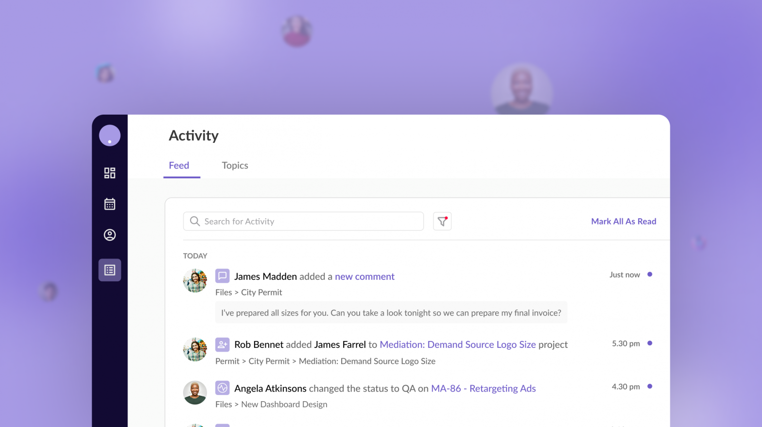
An activity feed consists of several small pieces of information displayed together. Depending on the use case/product, the type of information displayed may vary, but there is a set of standard components to keep in mind when building a chronological activity feed.
Inspiration was taken from Designing activity feed notifications for your Microsoft Teams app

Let’s deep dive into each component:
Also known as an “avatar,” it has the functional purpose of clearly identifying the team member who has carried out an action. They can take the form of photos, initials, emojis, illustrations, etc., reducing the clutter on-screen and making it more visually appealing.
For more information on avatars, visit “6 Ideas For Creating Better Avatars Placeholders”.
Similarly, icons are used to identify the type of activity that has been carried out by an actor, e.g. comments, replies, mentions, reactions, added or removed content, apps, etc. Depending on context and value, a designer may choose to use or omit this component.
Although, as mentioned above, avatars are a powerful tool for identifying users, there is also a need to display the “actor name” because a team member may not know or recognize the actor.
Another important aspect is a clear and concise description of the activity that helps users easily and quickly comprehend the information and take relevant actions.

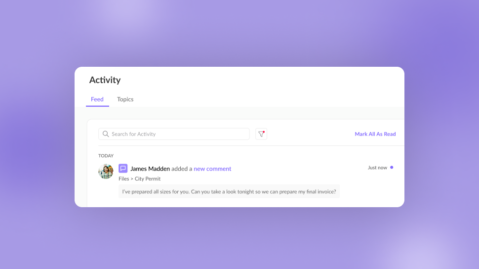
Depending on the type of activity or use case, a designer can choose to display a text preview of the activity. For example, if the activity description is “John added a new comment,” then the text preview would be a small snippet of the same. Another example is if a task is assigned to a team member, then a text preview of the task details should be visible. The user can view this information from the activity feed, which saves them time.
It allows users to identify the exact date and time an activity occurred. Therefore, if a user wants to revisit activities from a particular date or date range, they can do so. Additionally, if an activity is time-sensitive (e.g. tasks), this helps you and your team members track its progress.
A user should be able to access an activity that has taken place, for which they would need to know its location. We can achieve this by displaying a breadcrumb that indicates the activity’s location or an inline link that guides the user to the associated activity.
As seen above, there are a large number of components that make up an Activity feed, therefore, there is a need for some global-level actions to manage all the activities in the feed. The following are a few.
Activity feeds record the day-to-day activities of all team members on the platform over some period of time. Consequently, the feed is very long and makes it difficult for the user to sort or find a particular activity (e.g. comments, mentions, updates, etc.). Therefore, allowing users to filter and search through the activity feed to find relevant information is a great way to fulfil the above needs.

Keeping track of the new activities happening in the application to stay up-to-date and in sync is the key function of an Activity feed, so it needs to be highlighted.
Since an Activity Feed encompasses activities from all teammates working on a project in different capacities, there could be a long list of notifications that may not be relevant to the user. Therefore, the user should be able to mark activities (as a whole or individually) as read. This feature also serves as a mental confirmation for the user that they are up to date.
Find out why your product needs a usability review?
Now that you know about all the essential components that your application’s activity feed must contain, you must think about how to design it. The best practices suggest that you do the following:
When building a chronological activity feed, user experience should never be considered secondary. These tips will help you during the process.
Looking at the components and examples above, we can see that the “Activity feed” is the perfect one-stop shop for handling and presenting dynamic and constantly updating information in a project. It keeps users aware of changes in their work ecosystem, which fosters team collaboration and productivity.
Keep in mind that each project is unique and demands an adapted activity feed depending on its needs. There is no hard and fast rule that all components mentioned above in the blog are necessary; they are merely building blocks to get you started on your next project.

