A typeface is a visual personality of human language. It gives mood, emotion, and tone to the voice of a product.
Typefaces play a huge role in reflecting a brand’s personality into its product. As choosing the right typeface becomes more and more challenging each day with thousands of web and print fonts available, I tried to come up with a logical structure to ease the process and make it right.
It is recommended and most common to use not more than two different typefaces in a single product (unless you have specialized requirements for a specific set of data). These are generally categorized as display and body fonts.
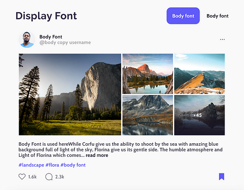
Display fonts are used in large headings/titles of a product to reflect a brand’s identity. These have to be carefully chosen to reflect the same qualities of the brand identity and aesthetics and do not have any major limitations of readability or legibility (as they are used in large font sizes).
However, body fonts are used in the entire product in various small sizes and various cases. These need to be extremely readable and legible. Since very few typefaces are considered to work well as body fonts, most products use the same typefaces such as Roboto, Open Sans, Source Sans Pro, Lato, Arial, Montserrat, Proxima Nova, and some more.
Some common characteristics that a good body typeface needs to have –
• It needs to be web font or a web-safe font
• It needs to have legible letterforms
• It has to be readable in the smallest font sizes of 10px, 11px and 12px.
• It has to be well paired with the display font
• It has to reflect the tone or mood of the brand
• It needs to be available in various weights and styles
Choosing the right body font that works well with the brand and has the above-mentioned characteristics is a difficult process.
Here are a few steps that you can use to find the right body typeface in your web product.

2. Make a token of the commonly used characters in your product. For eg- A fintech product will have primary characters as numerals, a flight ticket booking service might have a mix of numerals and alphabets, or you may just have alphabets in your product.
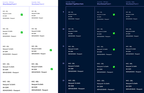
3. Test this set in the smallest of font sizes and compare the list together in dark and light themes with a standard typeface like Roboto or Open Sans. You can download this free Figma sheet to use in this step.
4. Eliminate typefaces that do not work in smaller sizes or just select around 10 typefaces that work the best.
5. Map all the filtered typefaces on an emotion/mood scale. You can use the above free Figma sheet to begin this.
Here are two things that can help you make this scale —
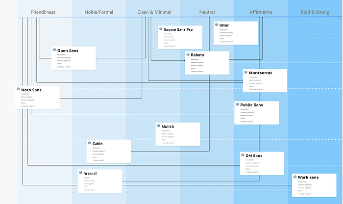
6. Select the typeface that best reflects your brand’s tone and eliminate others. Once this sheet is filled, you’ll be surprised you’ll only have a few choices left. Maybe two or three.
Read More: Exploring the Influence of Colors and Fonts in Design
7. Compare letterforms of the chosen typefaces in a template.
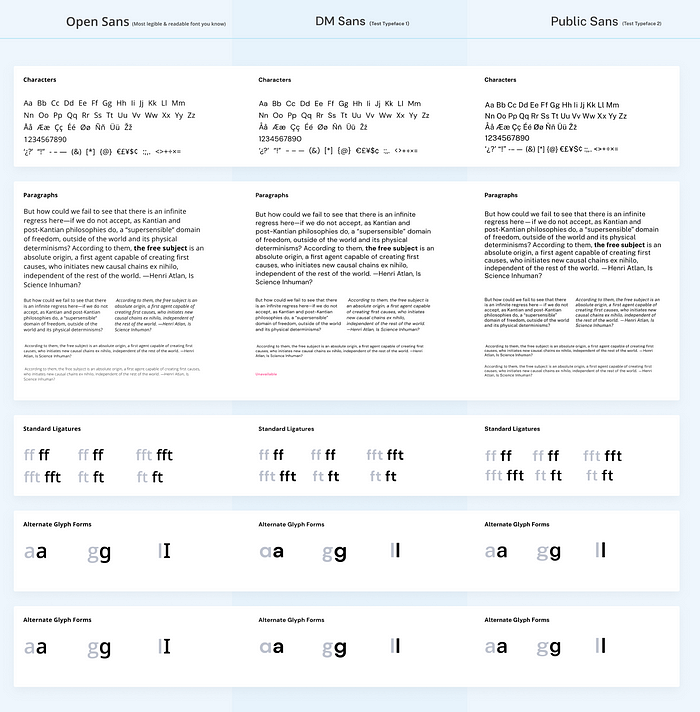
Always ensure that you compare your chosen typeface with a standard web-safe one so that you are aware of its limitations and you can use it wisely. I found this amazing guide from Toptal that summarizes readability and letterforms in web typography.
I hope these steps help you get started with the right body typeface in your next project. It is still an exhaustive list of steps, if you start with just 3 options in your list then you can just test the characters for legibility and begin. All the steps can only be used if there are a lot of options for initial brainstorming.
Read More: The Iterative Design Process: A Comprehensive Guide for UX Designers

