Introduction
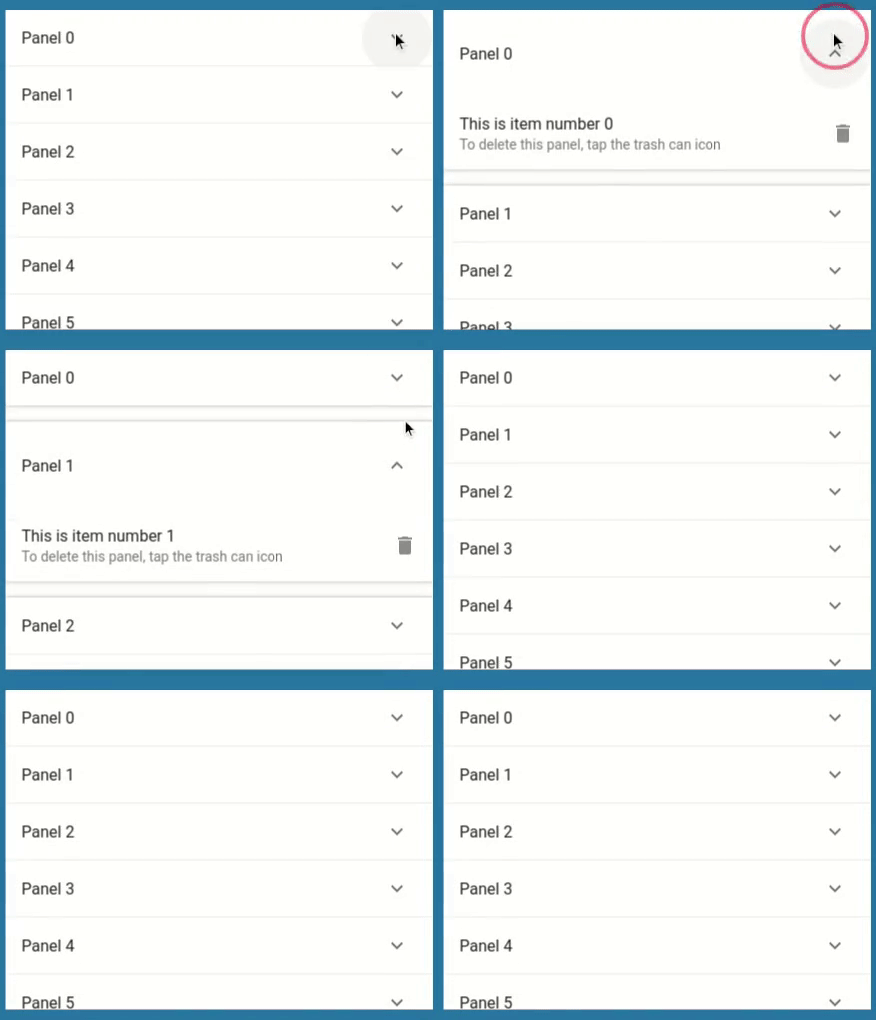
You must have seen this interaction in many of the apps.
What does Expansion panel list do?
Expansion panel list is a list that shows its children using expansion animation on click of item.
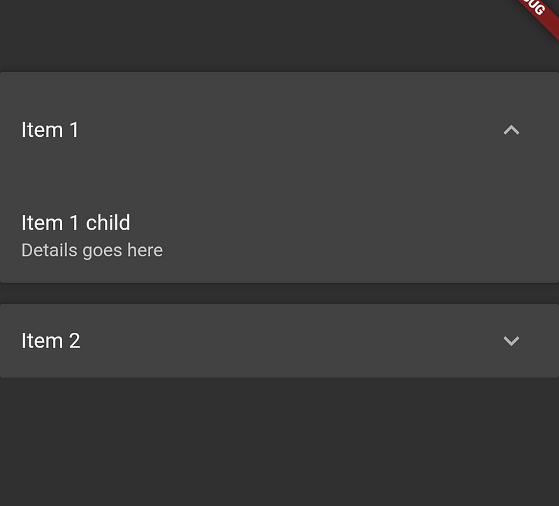
Let’s see the basic structure for the below output
ExpansionPanelList(
  expansionCallback: (int index, bool isExpanded) {},
  children: [
    ExpansionPanel(
      headerBuilder: (BuildContext context, bool isExpanded) {
        return ListTile(
          title: Text('Item 1'),
        );
      },
      body: ListTile(
        title: Text('Item 1 child'),
        subtitle: Text('Details goes here'),
      ),
      isExpanded: true,
    ),
    ExpansionPanel(
      headerBuilder: (BuildContext context, bool isExpanded) {
        return ListTile(
          title: Text('Item 2'),
        );
      },
      body: ListTile(
        title: Text('Item 2 child'),
        subtitle: Text('Details goes here'),
      ),
      isExpanded: false,
    ),
  ],
);
Understanding it’s properties
➊ expansionCallBack:
This gets called whenever the expand/collapsed button is pressed on any of the items inside the list.
It gives us two things.
- Index of the clicked item
- Whether to expand or collapsed the item clicked.
➋ children:
ExpansionPanel widget is used as a child for the ExpansionPanelList. This widget has got below properties.
- headerBuilder: Used to show the header of the item.
- body: Used to show the details of the item when expanded.
- isExpanded: This is very important as it decides whether to expand/collapsed the item or not. Defaults to false.
- canTapOnHeader: Be default, You have to click on ^ icon to expand but you can pass true to this property to also make header of the item clickable.
➌ animationDuration:
Used to define the duration in which the expand and collapsed animation should complete. It defaults to 200ms.
However, it is recommended to keep it to the original you can still change it to anything like this.
animationDuration: Duration(milliseconds: 300),
Let’s make it dynamic
The basic code above won’t actually expand/collapse. That was just a starter code to make things clear before we move on.
So how do we actually make it work? Here are the steps.
➊ Create a class that will hold the data for the item.
class Item {
  Item({
    this.expandedValue,
    this.headerValue,
    this.isExpanded = false,
  });

  String expandedValue;
  String headerValue;
  bool isExpanded;
}
bool isExpanded will be used to determine whether the item needs to expand or not.
➋ Prepare a list of items.
List<Item> generateItems(int numberOfItems) {
  return List.generate(numberOfItems, (int index) {
    return Item(
      headerValue: 'Book $index',
      expandedValue: 'Details for Book $index goes here',
    );
  });
}
List<Item> _books = generateItems(8);
➌ Map each item in the list to ExpansionPanel because we are going to use it as a child for the ExpansionPanelList and not the Item itself.
children: _books.map<ExpansionPanel>((Item item) {
  return ExpansionPanel();
}).toList(),
➍ On receiving expansionCallback change the isExpanded parameter of the item inside the list of books and rebuild a widget.
expansionCallback: (int index, bool isExpanded) {
  setState(() {
    _books[index].isExpanded = !isExpanded;
  });
},
Click on RunPen to read and play with the code
Thanks for reading. If you found this article to be helpful please share it with your friends.
Also read – Four Essential Types of ListView in Flutter and How to Utilize Them.


