The Flexbox layout mechanism gives you an ability how you can construct the component in the layout. The Flexbox will solve the layout challenges. You can also use Flexbox with multiple components. Flexbox is also used to layout multiple items within the container as well.
Exploring justifyContent Property
So let’s see how we use Flexbox layout in the React Native app. Now let’s add the justifyContent property in the Flexbox. justifyContent have multiple values as listed below:
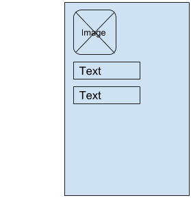
- flex-start
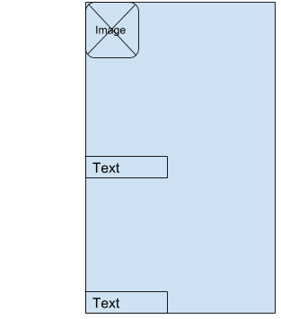
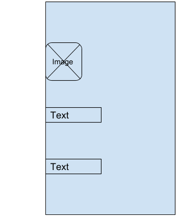
The Default behaviours of Flexbox is shown in the below diagram. And the JSX is like
<Image />
<Text />
<Text />
It’s basically left align and vertical(column) direction.
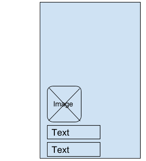
- flex-end
When add justifyContent: ‘flex-end’, the all content will shift down to bottom.
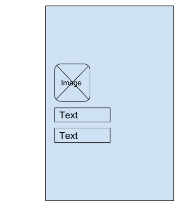
- center
When adding justifyContent: ‘center’, all content will shift to the center of the layout.
- space-between
If we add justifyContent: ‘space-between’, then the Flexbox will add equally space between all the elements. So the container takes all the elements and adds maximum equalize space between each element.
The first item is at the very top of a container and the last item is at very bottom of the container and then all the space in between the intermediate items is equalized so they are completely equal in between their last space around as much like space between.
- space-around
Space around as much like space between but it also allocates item to the very the head of the very first item and after the very last item as well.
So, in theory, each of these white spaces in here one two three and four should be completely equal whenever we’re using space around.


