
The UNDP (in 2019) states that the number of volunteers globally may soon exceed one billion. That is only 1/7th the world population.
Voluntu was a short, passion project that I undertook as my first icebreaker task at Aubergine. The idea for the project was something that I had been working on for a long time before I actually worked on it. I would go so far as to say that the idea stemmed from personal struggles to find relevant volunteering opportunities when I wanted to.
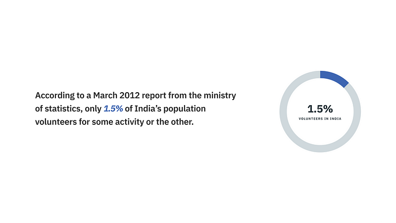
According to a March 2012 report from the ministry of statistics, only 1.5% of India’s population volunteers for some activity or the other.
Voluntu aims to:
How does the product scale in terms of business ?
Collaboration with companies for mandatory CSR | Promotion of large scale campaigns that will contribute to revenue
I started off the research process by doing a couple of expert interviews; the people who were active volunteers and were involved in activities. Upon speaking to them, there was a dire need for making the “seeking opportunities” part of the process more accessible. For organizations, volunteers who didn’t flake at the last minute were hard to find. I also actively volunteered from 2017–2019 and some of these insights are from personal experience too. Following are some of the insights I gathered:
Desk research gave a base for this project. I tried to understand the statistics around volunteering, the need for volunteering, and the impact of volunteers. I wanted to understand what pushed people towards giving to society and why some people stayed away from it. Here are some excerpts.
It is because “Access to global spaces is uneven, and many volunteers are excluded because of a lack of money, technology or literacy” as in the UNDP report.
It is also important to note that there is gender disparity here as well, women have lesser access to technology than men.
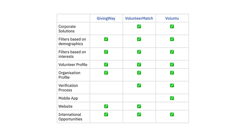
Here, I chose to compare and analyse GivingWay and VolunteerMatch.
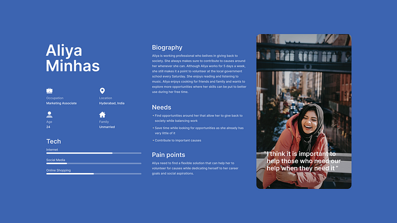
It is crucial for us to understand the needs and lifestyle of Aliya —someone with an innate passion for volunteering. We need to look at their motivations so that we can create a solution that can satiate their requirements
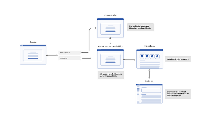
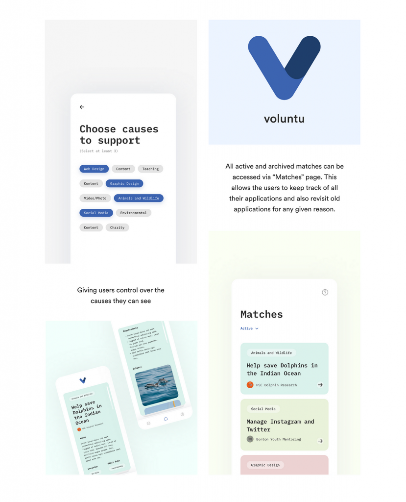
This was a short project and I decided to solve only the main user flow which would cover the flow from user sign up to their first match. Below, I’ve shown why we’d need to use a certain social sign-up option and how a user must choose their causes so that we can use that information to streamline the cause pile.
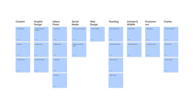
I used content sorting for the first time to understand how we could categorize the list of causes that a volunteer would be offered and how the listing can be auto-sorted.
Voluntu is volunteer-organization matching platform that uses the “swipe-right” concept to match volunteers with causes that they support. The interface was designed with the following features in mind:
This project tested my ability to think and work deeply in a fast-paced environment. The complexity of the project bothered me at first, but that is when I decided to solve the key issues first and then move on to more complex problems in the second iteration.
Also Read: An In-Depth Look at the Process and Principles of Lean UX

