Featured Image
UX Design

Why does your product need a usability review?

A diagnosis to check if your product is delivering the desired User Experience.

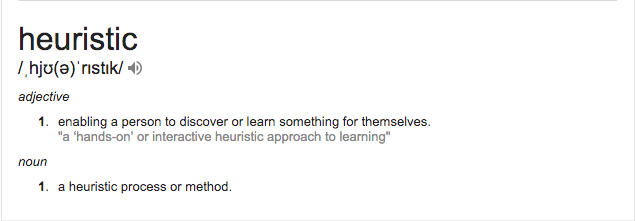
There are many terms for what we are talking about here. Some say ‘Usability Review’, others say ‘Design Review’ and in more technical terms, it is referred to as ‘Heuristic Evaluation’. They all mean more or less the same after all.

What is heuristic evaluation?

What Google Dictionary says:

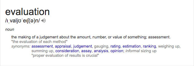
Elaborating its meaning in our world:

A heuristic evaluation is a usability detection method for digital products that helps in identifying usability glitches in the product design. It involves reviewing, judging and evaluating the design on the basis of the usability principles, which is also known as heuristics.

Many say that Heuristic Evaluation covers the evaluation of User Interface (UI). That being merely a myth, it is done considering the product’s overall User Experience (UX), of which UI is a subset.


Heuristic Evaluation of what?

  1. A product which is already out there.
  2. A product which is designed, but yet to be developed and has a prototype that can be evaluated.

Why is it important?

DESIGN PERSPECTIVE

  1. Feedback could be obtained early in the design process, and so if the product is going in a wrong direction, you know it and there is an opportunity to fix it.
  2. Spotting the correct set of heuristics to the issues could solve the issues with the best possible corrective measures.

BUSINESS PERSPECTIVE

  1. It could instil insights on the further scope of the product.
  2. It could point out some potential features of the product.
  3. It helps in reinforcing user engagement and hence increases conversions.

TECHNOLOGY PERSPECTIVE

  1. It could point out some technical flaws, for example, information taking too long to load, the flaws in the transitions which meant to behave in a certain way, technical glitches in accomplishing a user goal and so on.

How is it done?

The following ‘Hows’ is supported by the example of a Usability Review that we recently did for Clear Tax, which provides Tax related solutions in India.

1. STEPPING INTO USER’S SHOE AND EXPERIENCING THE PRODUCT

Designers are most often driven by their design to an extent that they can not come out of their zone and experience their own designs from user’s perspective. During HE, the product is seen by experts from the perspective and psychology of users. Various psychological models are considered, such as:

A. Perception
B. Learning
C. Mental models that are used for predicting interactions
D. Emotion-driven behaviour
E. Cognitive stress and biases
F. Problem Solving and Decision Making

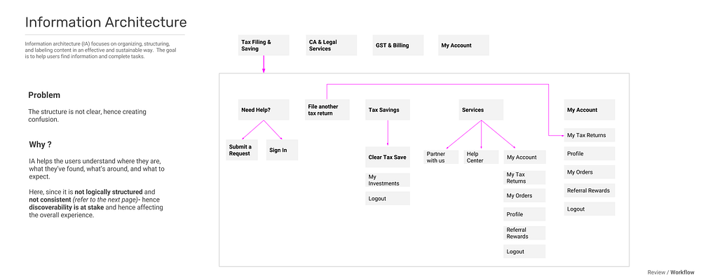
Review of Information Architecture of Clear Tax

Review of Information Architecture of Clear Tax

Also read: Selecting the Right Prototype Type for Rapid Design: Structure-Based Approaches

2. SCANNING THE PRODUCT UNDER AROUND A HUNDRED PRINCIPLES OF DESIGN

Contents Page from the book ‘Universal Principles of Design’

Contents Page from the book ‘Universal Principles of Design’

It is important to consider principles of design and not just Principles of UX. By considering universal design principles which are coined to put light on human factors, the pinched design solutions could be spotted. Most design principles come hand in hand with solution based implications which makes way for improvement, and in turn, improves the experience of the product as a whole.

It is fairly impossible to put them all in a nutshell, it is highly dependent on personal approach and style of designers towards design, and also changes from time to time.

Review of Workflow of Clear Tax

Review of Workflow of Clear Tax

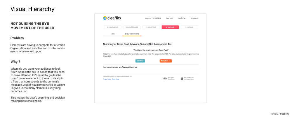
Review of Visual Hierarchy of Clear Tax

Review of Visual Hierarchy of Clear Tax

3. TESTING THE PRODUCTS THROUGH JAKOB NIELSEN’S PRINCIPLES OF HEURISTICS

One of the best known and commonly practised sources of heuristics is the set- Ten Usability Heuristics developed by Nielsen in 1994.

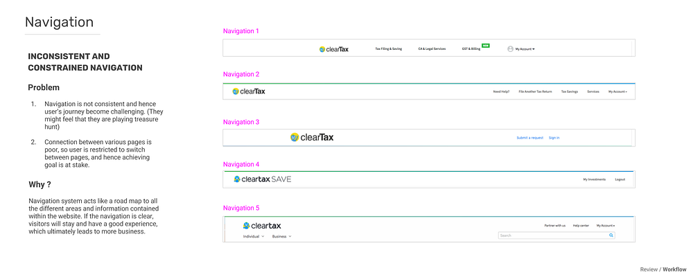
Review of Navigation of Clear Tax

Review of Navigation of Clear Tax

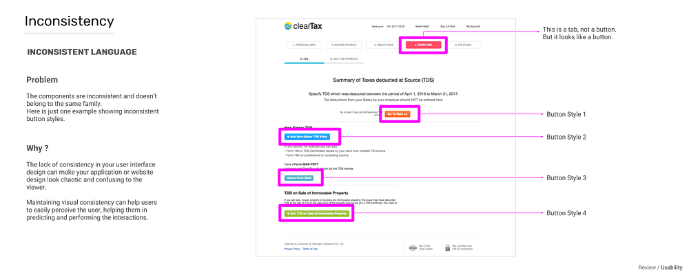
Review of Consistency of Clear Tax

Review of Consistency of Clear Tax

Well, this doesn’t mean that reviewers assign a specific heuristic to each potential problem. Heuristic Evaluation is an overall judgment of the product.

Also read: Evaluating UX Design: Is Your Digital Product Granny-Friendly?


What good in the end?

From our experience of doing more than 100 reviews, we have found out that- on an average, there is a potential of 2x increase in user engagement and revenue.

Discovering some glitches in the design and improving them, is surely something to desire for. It proves to be helpful in shaping a desired user experience, improving user engagement and eventually benefit your business.

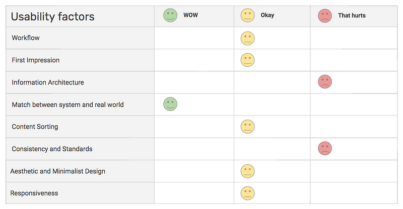
An example of a report card that we give after diagnosing a product

We, at Aubergine, are all for spreading good experience out there. Have a look at some usability reviews that we have been up to recently:

Slamdata
Analytics Solution for NoSQL Data
B2B, Web app
Usability Review here

Reserve
Hospitality Technology
B2C, Web app
Usability Review here

Hubilo
Event Management Software
B2C, Mobile app
Usability Review here

Do you own a product?
What do you do for a usability review?
If you do a rigorous user testing, doesn’t that cost a fortune? Well, Usability Review serves the same purpose, the only difference is we could do it for free.
Get a FREE Usability Review done here.

There might not be a lot of WOW moments, but that’s not gonna hurt for sure. Because finding those spots and converting them to WOW is what we are doing this for, isn’t it?

Also read: Usability Review of Noom: A Health & Wellness Tech Startup

author
Jui Pandya
I like when given a challenging environment. I believe design should be independent and it should talk for itself. I try to tell stories through designs. To me, a design is nothing but storytelling in a strategic manner, so that user's interest is best caught and harmonious experience is delivered. Every time when I think how we focus on making user's lives easy, it feeds the satisfaction of my existence as a designer.